


It's the third week of this amazing journey in Side Hustle Portfolio Bootcamp and as always, we were given another amazing project to work on. We used the word 'amazing' sarcastically though! To put it appropriately, it was quite overwhelming, to say the least. However, as a team, we always welcome such challenge. This week we embarked on a journey to unravel the FIFA World Cup insights and analysis. We however drew insights from the 1930 to 2014 tournaments because after our research, we discovered that most data sets on the 2018 competition were insufficient and lacking in details, so including it might affect our analysis. Follow us through this interesting journey from scraping a website for our data, collecting our data, cleaning our data and finally analyzing it through visualization in Power BI.
Searching For Data
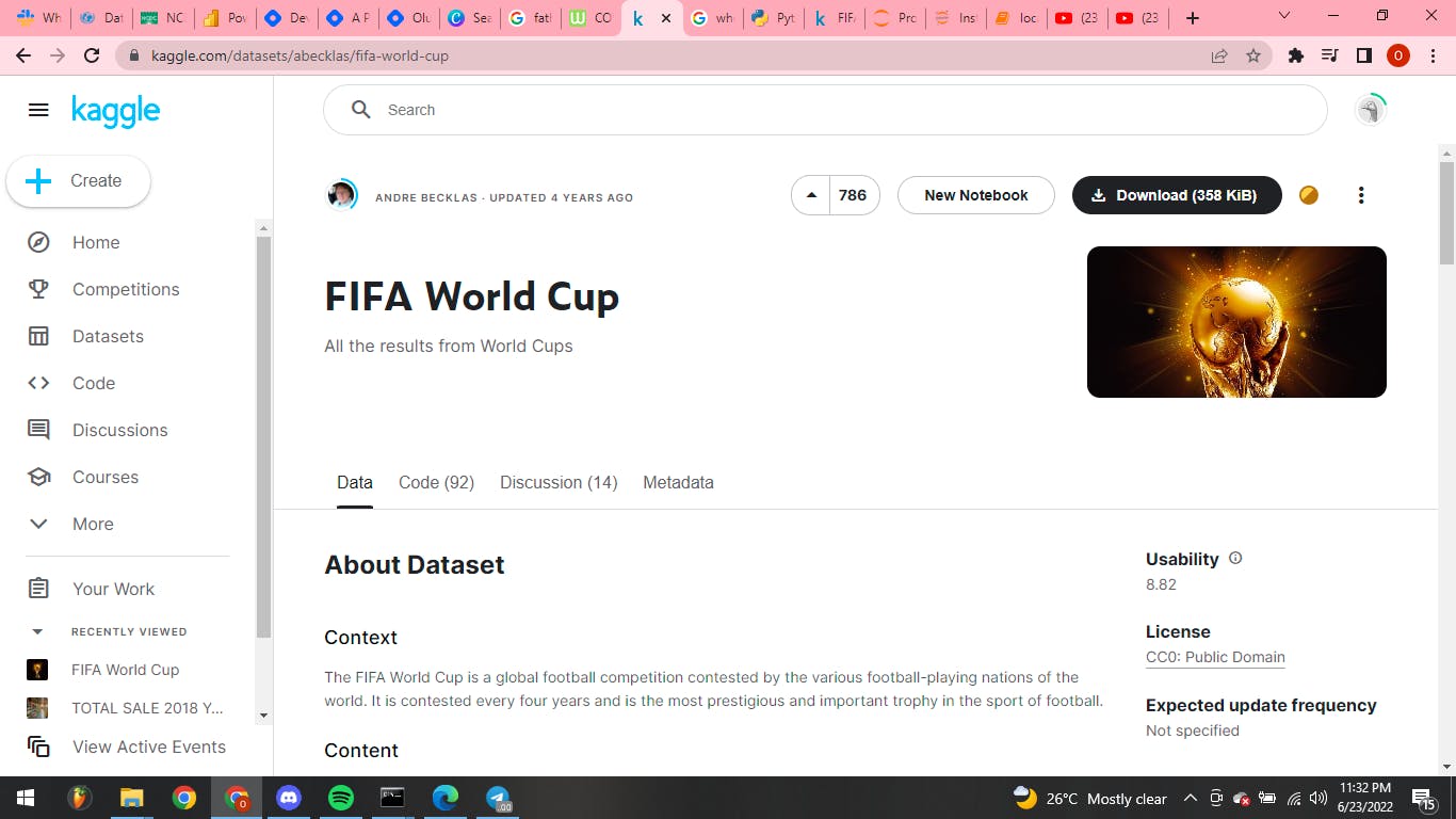
After much research, we settled for Kaggle website. Here, we found the appropriate data for our analysis. We then copied the websites URL and moved on to our scrapping process.
Scraping Using Jupyter Notebook through Python
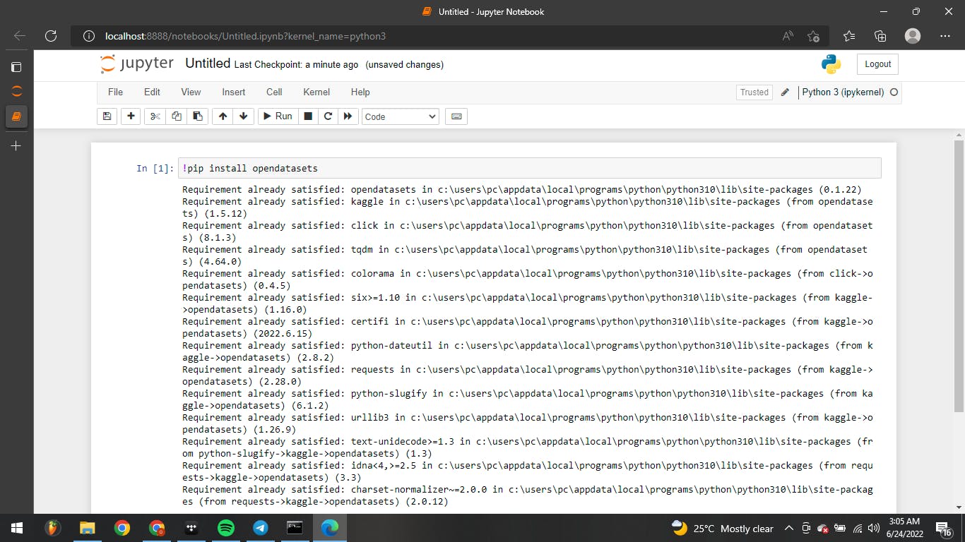
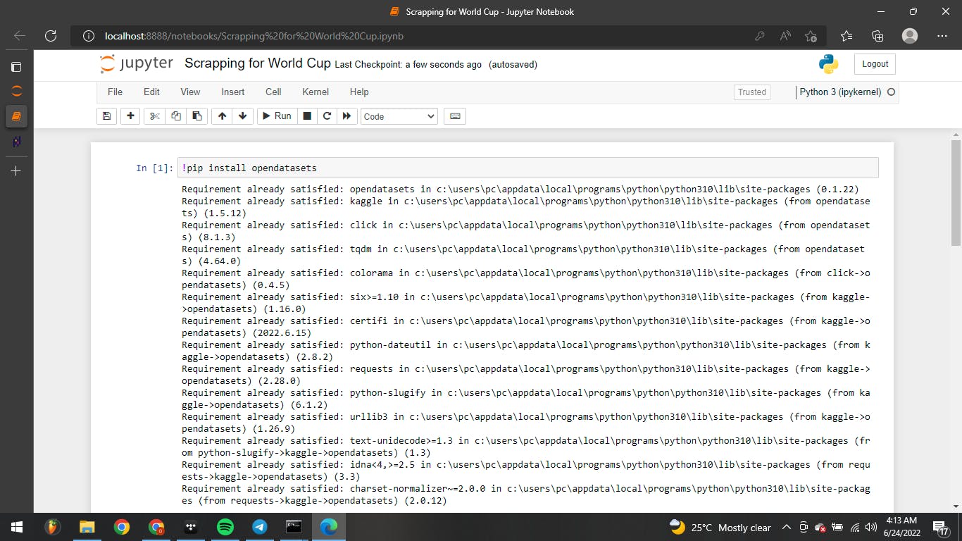
Scrapping is a process of importing information from a website into a spreadsheet or local file saved on the computer. It is one of the most efficient ways to get data from the web, and in some cases to channel that data to another website. To scrape our data, we decided to make use of Jupyter Note Book. To start with, we installed python, then we installed the jupyter note book through python with the command 'pip install jupter notebook'. After the installation, we opened the jupyter note book with the command 'jupyter notebook'. This command brought some codes, which included the jupyter url that opened the notebook on our browser and we then began our scraping. To scrap we created some commands, the first was 'pip install opendatasets' and then we clicked on 'run'. This is to prepare Jupyter to open the datasets we want to download. The input led to the release of some commands to show that it was successful.
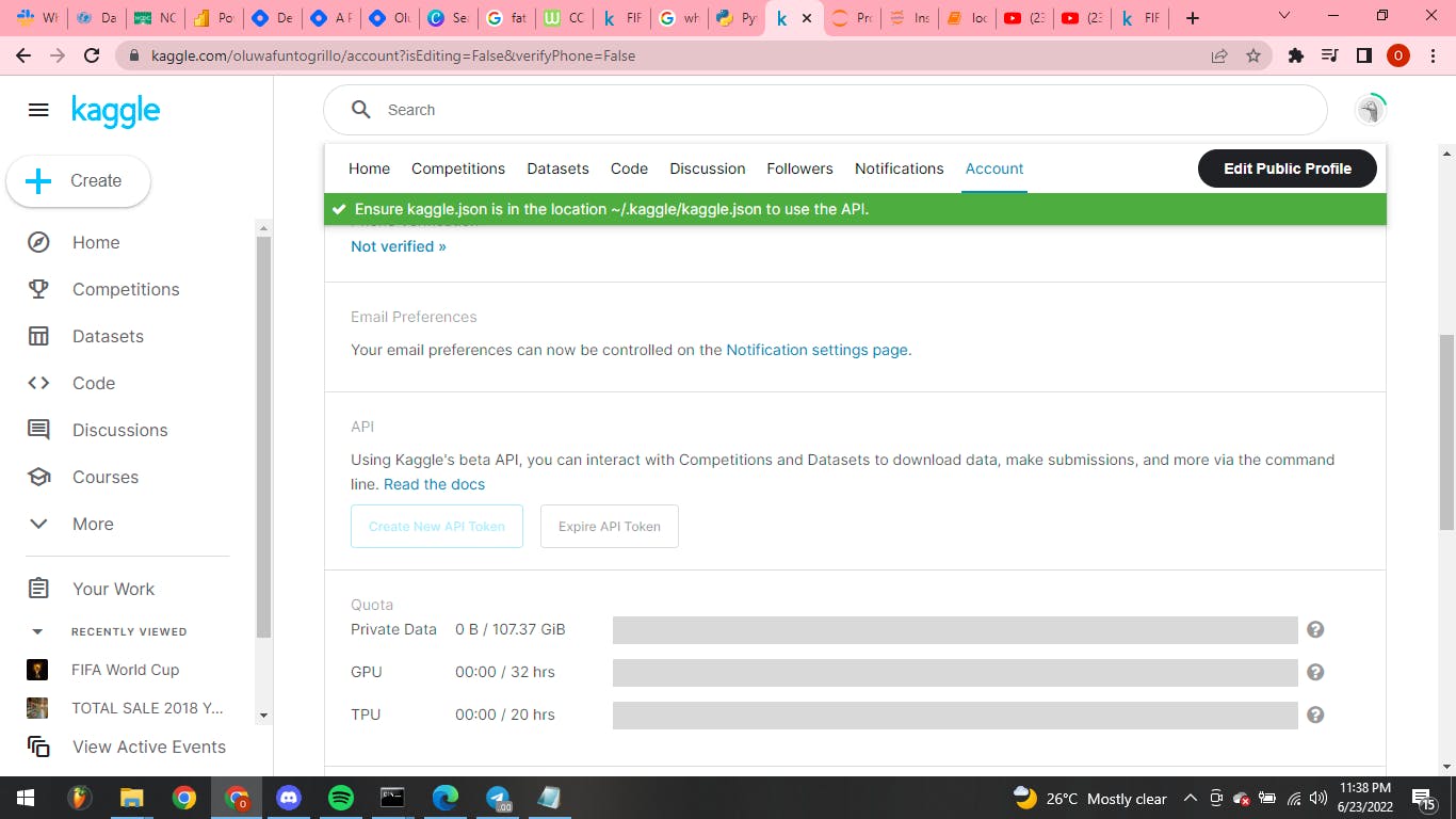
In order to download our data using Kaggle API, it was necessary for us to include our kaggle username and kaggle key. So we went back to the Kaggle account setting to retrieve these details. We clicked on ‘create new API token’ and this gave us our details which we copied in a note pad.
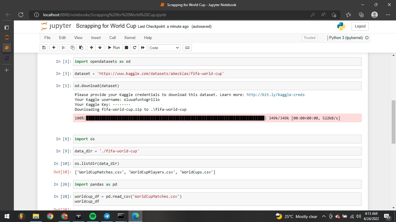
Here, we created a command to fetch our data and pasted the kaggle website url which we copied earlier- kaggle.com/datasets/abecklas/fifa-world-cup . Then we created a command to download the dataset, which required our Kaggle account details that we copied earlier, namely; our kaggle username and kaggle key. After putting these details, our data started to download. We needed some python libraries like Pandas to simplify our scraping, so we installed it in python with the command 'pip install pandas'.
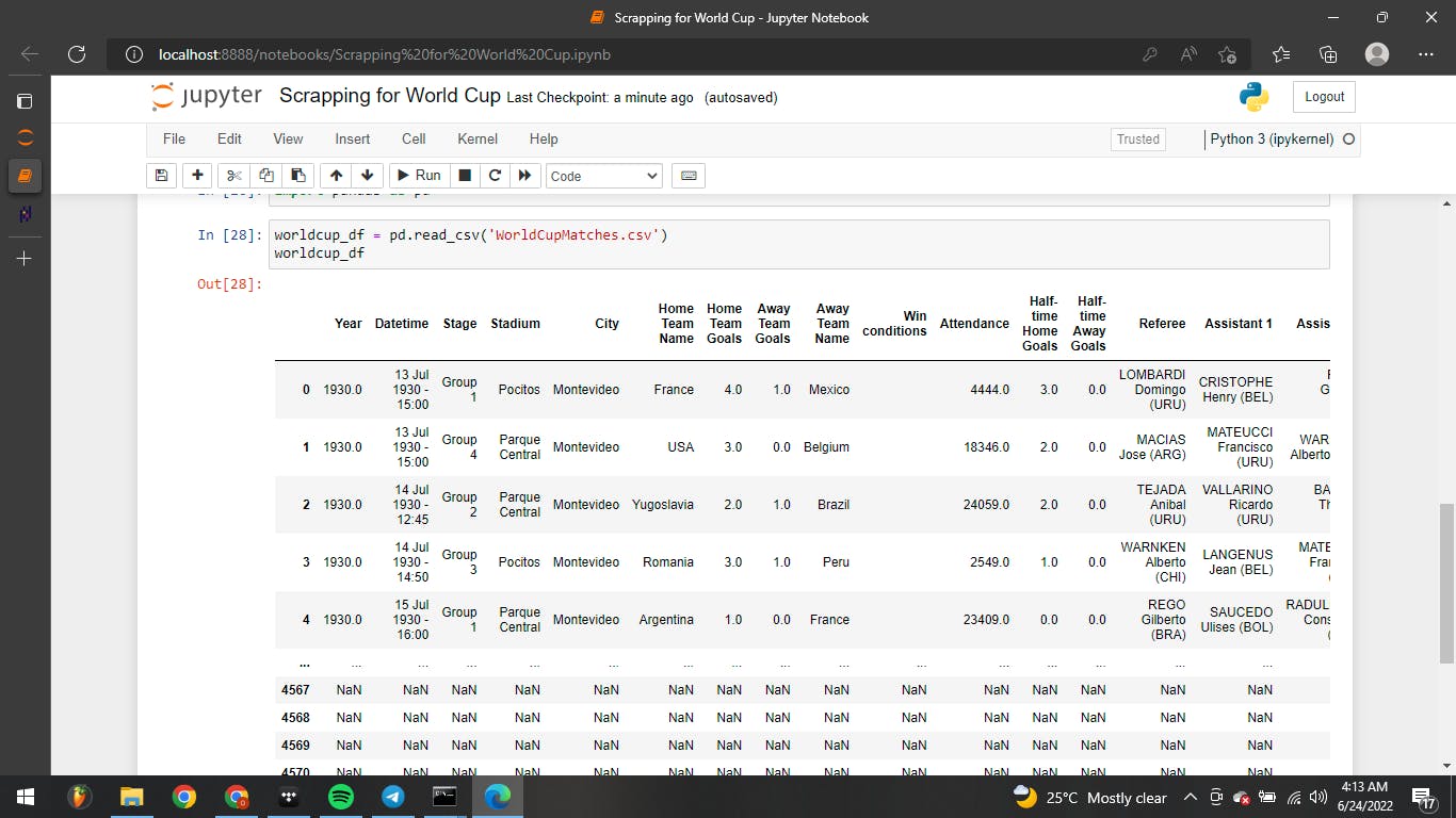
We included one more command and we were finally able to convert our data to a csv file as seen in the image above.
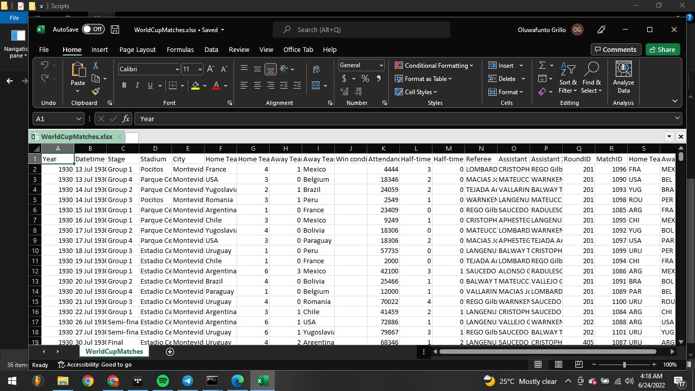
We saved the csv file to input into Power BI for further analysis and also saved it as an excel file to make our excel analysis easier.
Cleaning Data with Power BI Query Editor
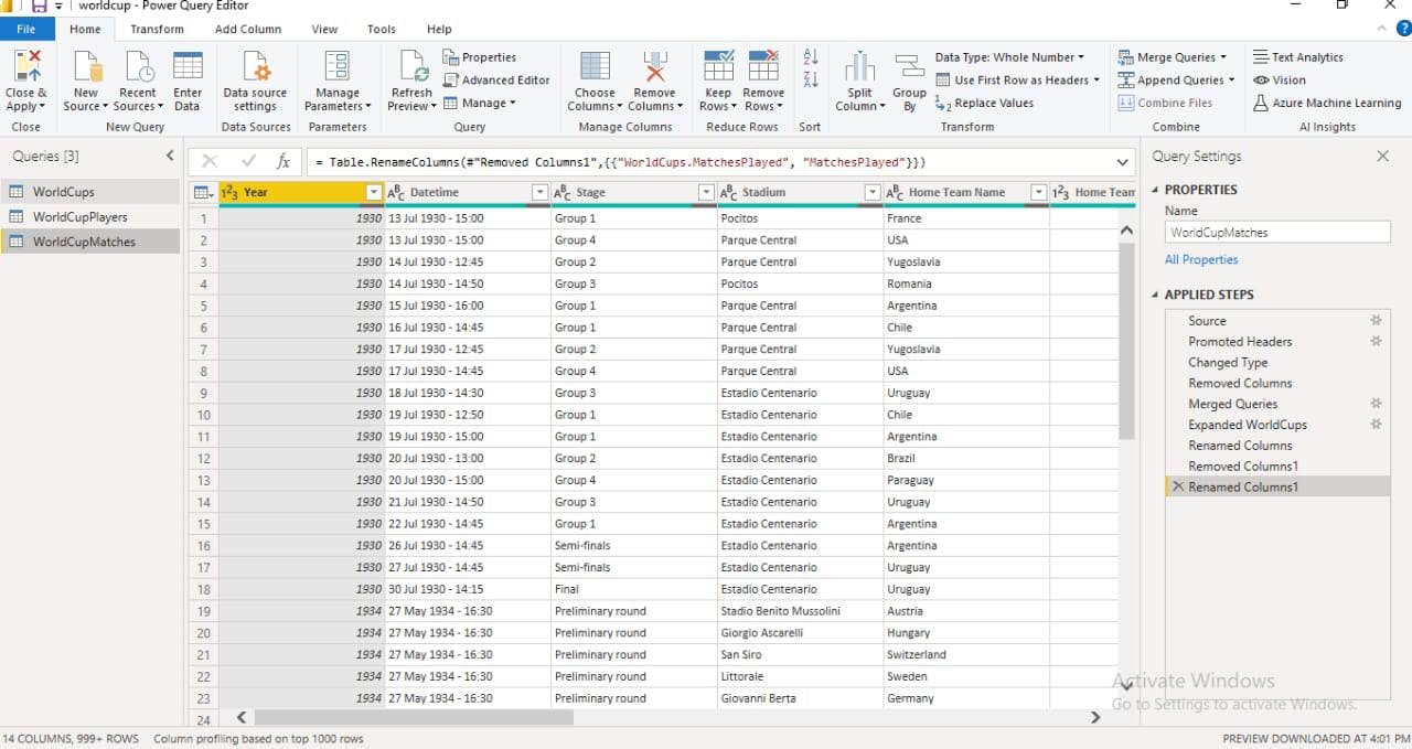
In Power BI we clicked on 'get data' to identify the data source we would be using for our analysis. We then selected the csv option and chose our file. After the file was displayed, we clicked on 'transform data' which took us to the Query editor. Here we did some minor cleaning like removing unnecessary columns that wont be relevant for our analysis, we changed some of the texts type and promoted our headers.
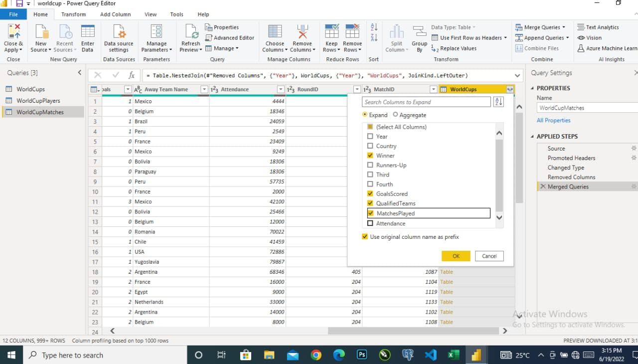
We duplicated our table to create two other tables and expanded the necessary columns in each table. We also made use of the ‘merge queries’ function, to merge our tables. To use the merge queries function, it is important that the tables share a column in common. For our tables, the column the shared in common is the ‘Year Column’. It is important to note that we made use of the ‘inner join’ function while using our merge queries function. After this, we clicked on ‘close and apply’ on our home tab to close the query editor and load our cleaned data to the Power BI interface.
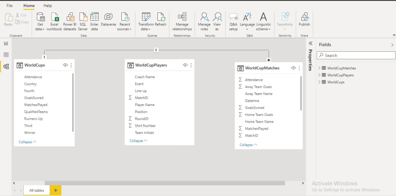
We did our modeling in POWER BI. Where we created a relationship between the table to simplify our analysis and make it error free. Then we moved to our visualization.
Data Visualization Using Power BI
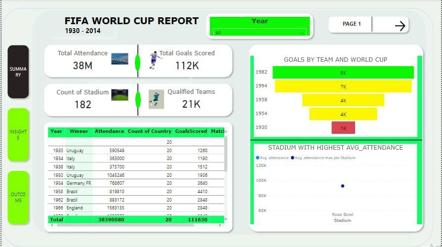
We chose green as our dominant color to give an illusion of the football pitch. A text box was used to display the name ‘FIFA WORLD CUP 1930- 2014’. To display the years, we used a sliver and formatted it to make the color green. Then we included page 1, with ‘cntrl +page 1’ taking us to the next page. Also shape was used as the background and we shadowed the shape. For the shape showing total attendance and total goals scored, count of stadiums and qualified teams, the background was white and we removed the back ground and put a line to give it that football pitch illusion again. A table visual was used to further reveal the years, the winner for each year, the attendance, the number of countries that participated in the competition, the goals scored by each country and the matches played per cup. A funnel visual was used to show the goals per team and per World Cup. If you hover your mouse on each rectangle, it will reveal more details like the goals scored, the percent of the previous years as well. We also showed the stadium with the highest average attendance. All stadiums initially appeared in our visuals, then we filtered it to show only the stadium that had highest average attendance by using a measure of attendance. By the left hand side we included 3 navigation bars; summary, insight and outcome. Clicking any of the bars will take us to the page.
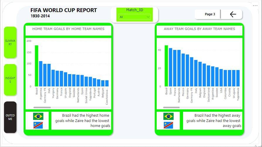
Here, the Match ID is the slicer, knowing fully well that the match is a primary key, from which all the match details can be derived. A stacked column chart visual was used to analyze the outcome for the home and away matches. The green on the Brazil bar was intentional as Brazil had the highest home goals while Zaire had the lowest. For the away team goals, Brazil also had the highest goals.
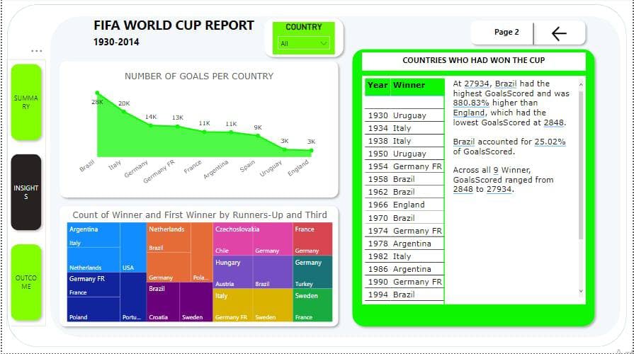
Here, the country is the slicer. An area chart was used to analyze the number of goals per country. We also included an analysis to reveal the count of winner, first runner up and the third position in each year. In the next table, we used a table visual to show the winners for each year. A smart narrative was included here also to gather all the analysis on this page and put it in written format. The blue ink below some of the text was also included intentionally, as it also reveals more information.
Conclusion
Our analysis brought to light that Brazil is the highest goal scorer for both home and away matches. Hence, we recommend that their training, diet, and playing format should be studied adequately by other groups. We also noticed our country Nigeria is no where to be found among the top winning teams and goal scorers since 1980s, which is quite disheartening and shows there is an underlying issue which must be looked into properly by the essential stakeholders.