
A Disease Insight Analysis; Using HIV/AIDS and COVID-19 as a Case Study.


It is the second week of the side hustle portfolio boot camp and we were tasked to make a disease health analysis with specific parameters. It was quite a tasking but worthwhile journey. Getting data was not an issue, however getting data with the indicated parameters was overwhelming. We opted for two major diseases; Covid-19 and HIV/AIDS. In this article, we give a detailed analysis on the steps we took to arrive at our dataset, how it was analyzed, the visualization process and possible recommendations.
Data Scraping With Power BI
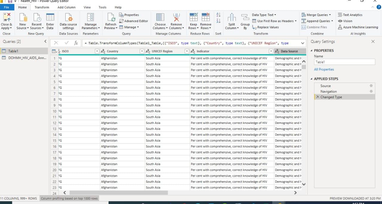
Upon realizing how difficult it was to get a data set that had all the parameters we had to include in our visualization, we decided to scrap data from different sources first. We did this by copying the URL of the sites, then pasting them in Power BI. One of the beautiful things about Power BI is it’s ability to get data from several sources, web inclusive. So we clicked on ‘get data’ on the Power BI surface, then clicked on ‘web’. After that we pasted the copied URL and clicked on ‘transform data’. This action carried our data to the power query editor where we were able to do some cleaning. There was no extensive cleaning required. We only got rid of unnecessary columns that were not useful for our analysis, changed the necessary text types and promoted the headers.
Merge Query
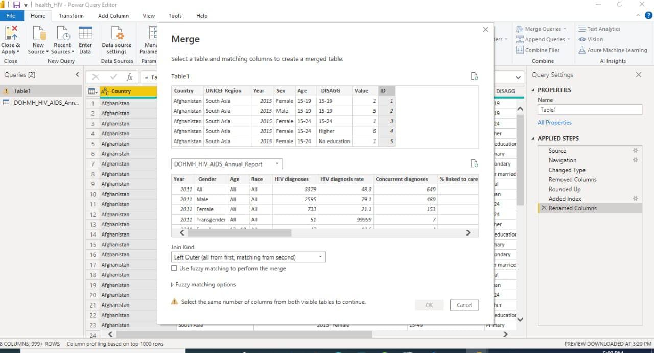
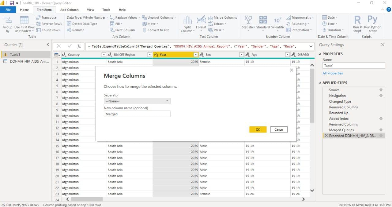
Remember we had to get data from different sources because we couldn’t get one data set with all the parameters. So after the cleaning, we opted to use the ‘merge query’ option on the Query editor interface, so as to merge our different datasets in one table. Then we used ‘the merge as new’ so it will create a new table. What does merge query mean? When you merge, you typically join two queries that are either within Excel or from an external data source. In addition, the Merge feature has an intuitive user interface to help you easily join two related tables.
Creating A Common Column to Ease Merging
To merge queries, it is essential that both queries share a column in common. This was not the case with our datasets. To solve this, we created a new column for each table and named it ‘ID’. This included distinct numbers from 1. After clicking on the merge query option, our two tables were displayed, we selected the table and matching columns and the tables were merged into one table.
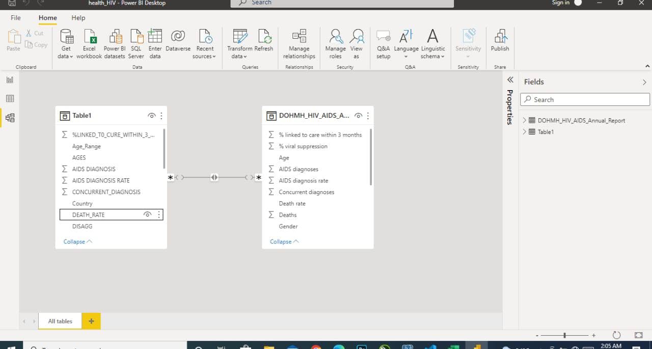
Creating a Relationship in our Data Model
Having successfully merged our queries, we clicked on the ‘close and apply’ option on the query interface, which loaded our data directly to the Power BI interface. On viewing our data model, we discovered that the tables had no relationship and this might present difficulties in our analysis. We created a relationship by placing a common column from one table with the other and this created a link, which is the visible line between the tables.
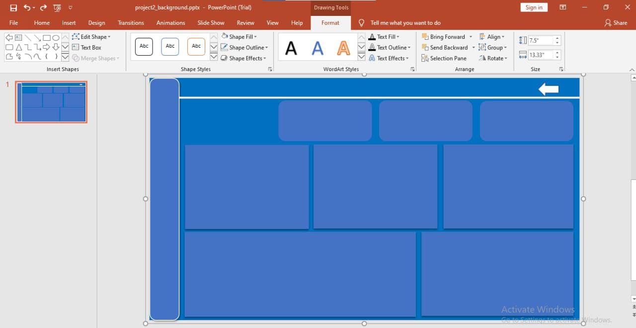
Using Power Point for a Custom Background
To make our visualization unique and beautiful, we decided to create a custom background using Power Point. Our custom background is a very simple one, were we made use of the color blue and inserted rectangular shapes across the surface. We then exported the background to our Power BI canvas to start visualization.
Visualization
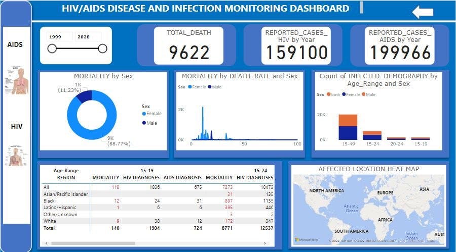
For our visualization, we made use of the card visual to show the total death rate, reported cases of HIV by year and reported cases of AIDS by year. We used the donut chat to show the mortality rate by sex, we also indicted the mortality rate by region, mortality rate by age range, count of infected demography by age range and sex and the affected location heat map, which we used a map visual for.
Recommendation
From our analysis we discovered that a higher percentage of women were infected and died from the disease. We therefore recommend that more awareness, campaigns and education is carried out for the female gender in general to drastically reduce the number of infected females. We also recommend that sex education is being taught at an early to age so avoid high figures. We also observed that there was high rate of infection and death amongst the blacks. Hence, more attention should be put into not just creating awareness about the infection but also providing affordable medication and treatment to reduce the death rate in black communities.
COVID-19
For our COVID-19 analysis, we scraped data from the NCDC website using Power BI, like we did for the previous data set. We also transferred our data in Power Query Editor to do some little cleaning, after which we loaded the clean data into the Power BI interface with 'close and apply' option.
Custom Background With Power Point
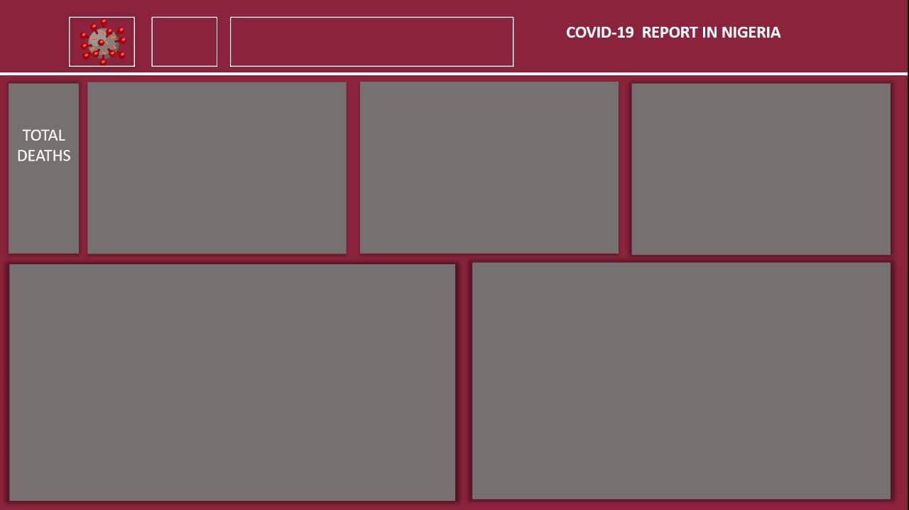
Just like we did with our HIV/AIDS visuals, to make beautify our visualization, we decided to create a custom background using Power Point. Our custom background is a very simple one again, we made use of the color wine and inserted rectangular shapes across the surface. We then exported the background to our Power BI canvas to start visualization
Visualization
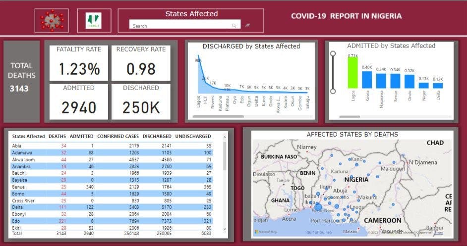
For our dashboard analysis, we used the card visuals to display the total death rate, fatality rate, recovery rate, admitted and discharged statistics. We made use of the decomposition tree visual to display the states affected, in such a way that you can search for any state and other visuals will bring out Covid-19 information concerning that state. We used the area chart visual to reveal the statistics of people discharged in each state. The stacked column chart visual was used to represent the statistics of people admitted in each state. We made use of the table visual to show the deaths, admitted, confirmed cases, discharged, undischarged statistics in all states in Nigeria. Finally we used the map visual to show the affected location heat map. Since the analysis was carried out on Nigerian states, we dimed it fit to insert a Nigerian map logo with the Nigerian flag colors. We also added a Covid-19 symbol to our dashboard.
Recommendation
Lagos and Abuja had the highest number of confirmed cases and this was most likely because both states are gateways for air travel, so they were in close contact with infected people who came into the country. We do recommend that if such should reoccur, international airlines should be shut down immediately and prior to that, people who arrived the country in recent times should be adequately monitored and quarantined for a period to curtail the spread and vaccination should be encouraged amongst the people. It was also discovered that Lagos had the highest number of deaths, we recommend that more awareness about vaccination and its benefit should be carried out in Lagos, more vaccination centers should also be made available and should there ever be another wave, more testing and treatment centers should be created in the state, also before travelling to other states, Covid status should be made known, to avoid spreading it to other states.