


It's another challenging week in the Side Hustle boot camp and as always we faced quite a number of obstacle. We however were able to accomplish our set goal for the week. This article is a brief guide on how we came about our data, how we collected it, cleaned it, visualized and analyzed it using both PowerBi and Excel.

Step 1 Download data : mavenanalytics.io/data-playground
Step 2
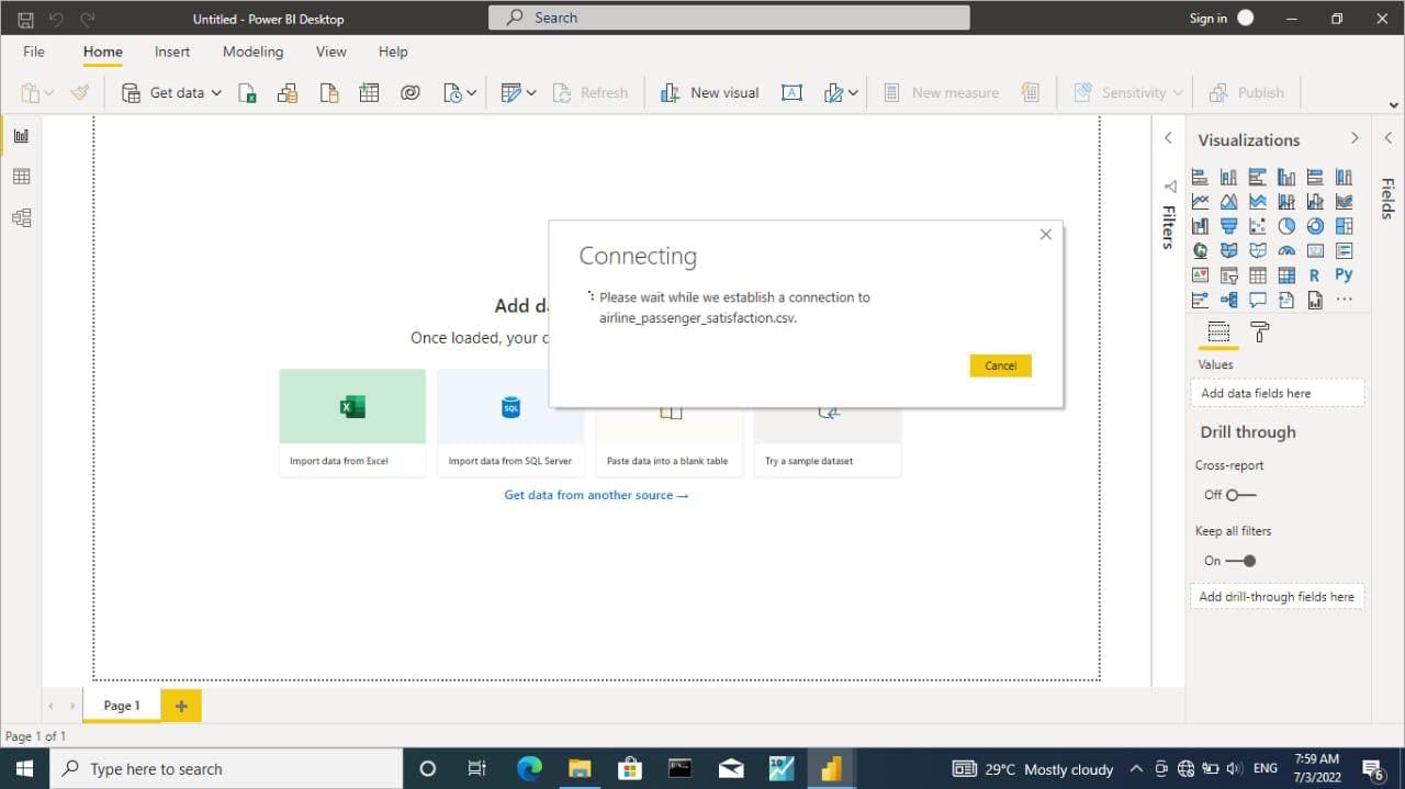
Importing the downloaded csv file "Airline passenger satisfaction" into Microsoft powerBi
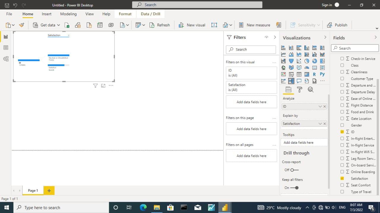
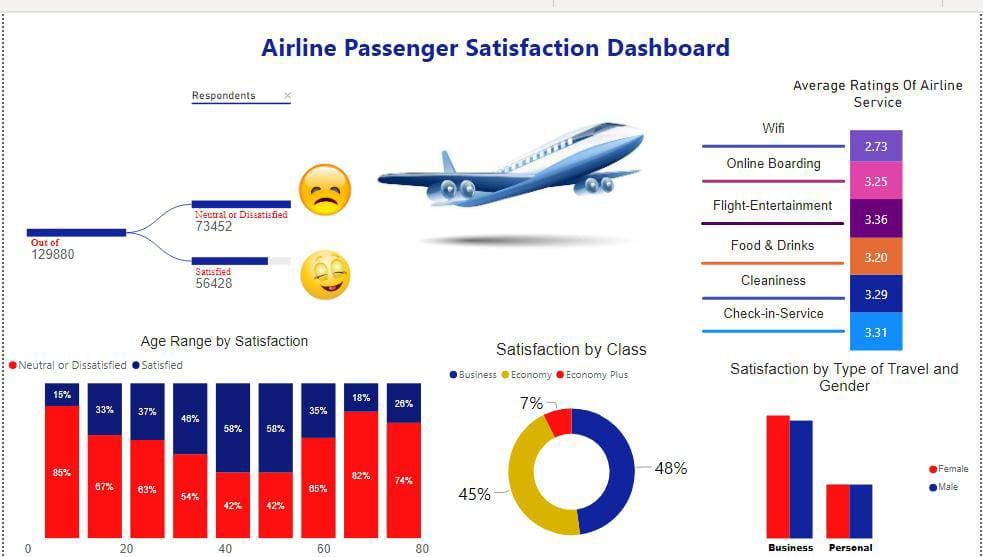
Step 3 : Used decomposition tree to show the total number of dissatisfied and satisfied passenger
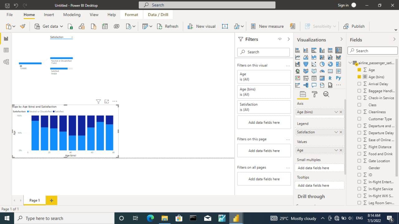
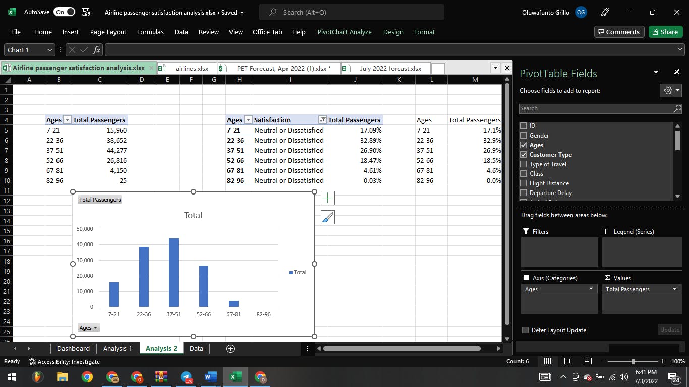
Step 4 : created a bin for age and visualized using stacked column chart by showing the "age range by satisfaction "
Note : To create a bin right click on the age and select group then you set the bin type to "Number of bins " and bin count "9"
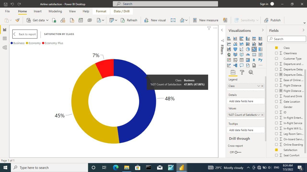
Step 5 : created a doughnut chart which shows the satisfaction by class
Note : It was observed that the Business class are more satisfied
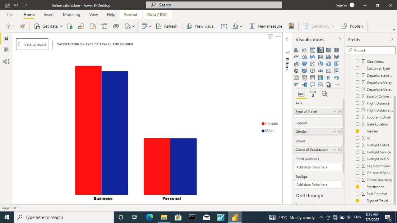
Step 6 : created a column chart which shows the satisfaction by type of travel and gender
Note : it was observed that the females are more satisfied than the males
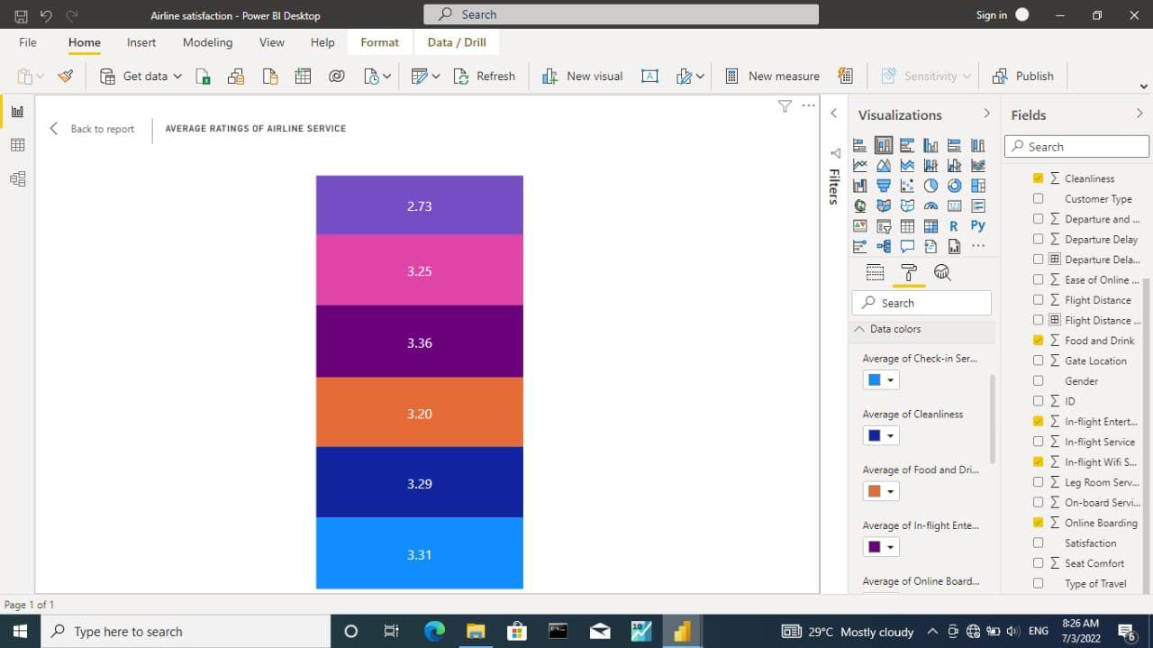
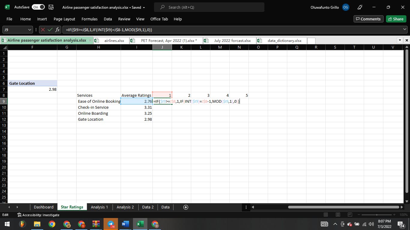
Step 7 : created a column chart which shows the average rate of each airline services
Note : it was observed that the wifi services has the lowest average
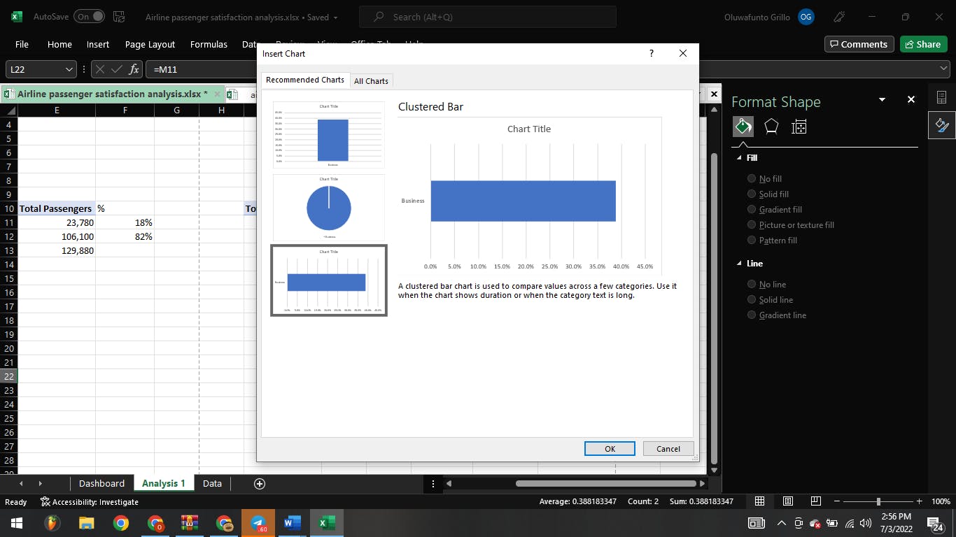
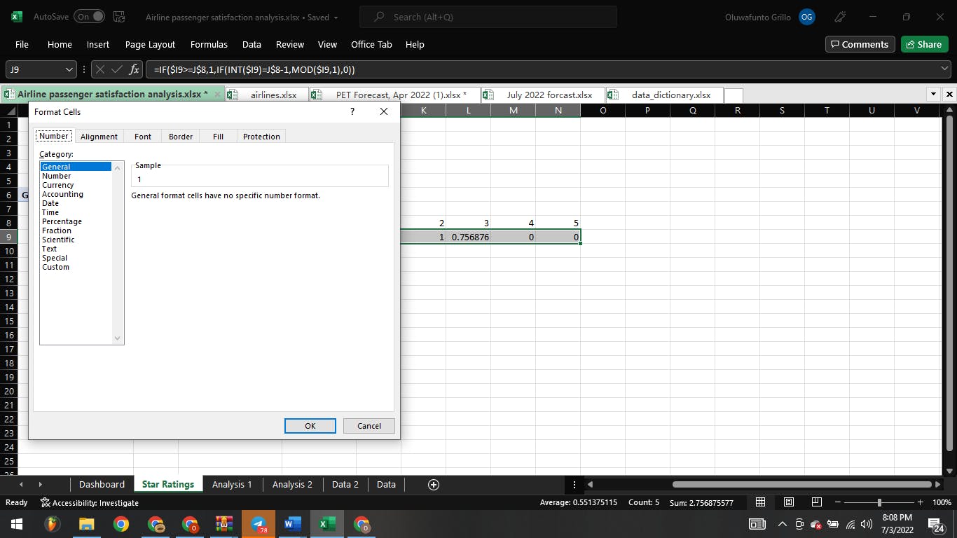
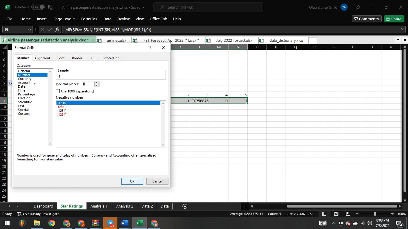
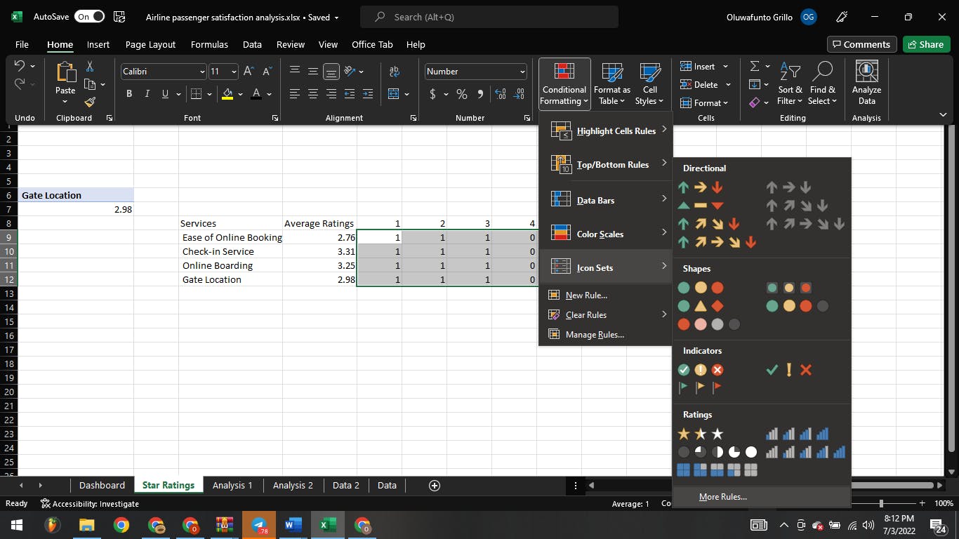
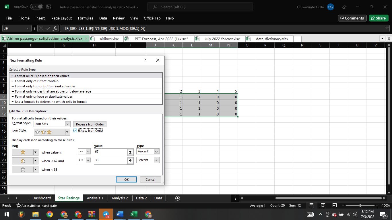
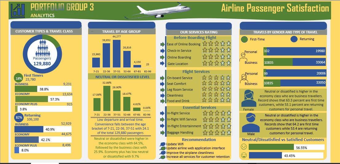
Excel Analysis